

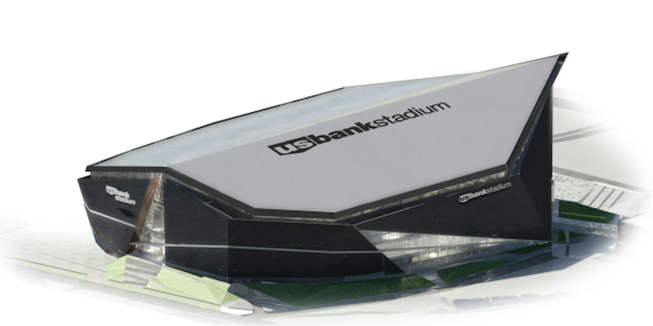
Clad in shiny black and glass and featuring a prow stabbing westward toward downtown Minneapolis, U.S. Bank Stadium will be a bold departure from sports venues around the country, a space-age longship that should quickly become iconic.
But people attentive to architecture and design say the look of the building will be weakened by its heavy commitment to branding.
I wrote a story for yesterday's paper about the business case for the naming rights deal. It appears to be a no-brainer for U.S. Bank, which had a $382 million marketing budget in 2014 and won't be troubled by another $10 million or so per year.
A debate over the look of the stadium is now starting to stir, however. As Nick Magrino at Streets.mn points out, the 467-foot-long name of the stadium will be visible for a long distance from the slanted roof, and that's "a pretty big symbolic piece of public space."
I spoke to a few architects last week but didn't include anything they said in the story because it wasn't a piece about architecture. This is a follow up. Here's a slide show of renderings of the stadium from every angle.
Generally the people I spoke with like the way the stadium (designed by HKS Inc., a firm in Dallas) looks from 1,000 feet, but aren't as thrilled with the branding or the street-level experience.
"The stadium will look intriguing from a blimp or at a distance, but will be both overwhelming and bland to the pedestrian on the ground, especially during the 355 non-game days," said Max Musicant, who runs The Musicant Group, a firm that seeks to better utilize public spaces.
Andy Campbell, a Minneapolis-based architect, said he doesn't have high expectations for buildings like this, given the branding that typically covers them.


