Is the design for HCMC’s new parking ramp in downtown Minneapolis going in the right direction?

The proposed structure in downtown Minneapolis is striking. But shouldn’t hospital structures be welcoming?

The Minnesota Star Tribune
September 12, 2024 at 3:27PM
A rendering of the proposed ramp for HCMC in downtown Minneapolis. ( Rendering courtesy of Snow Kreilich Architects)

The ramp is dead; long live the ramp.

The Hennepin County Medical Center is tearing down one old ramp to build a new six-story parking facility at 9th Street and Chicago Avenue S. It might provide clues about the complex’s aesthetic future. Hennepin Healthcare also plans to build a 500-patient tower between Chicago and 9th Avenue in the next 10 years, and perhaps the ramp is a taste of things to come.

The proposed ramp is a striking structure, with a deep red hue and a minimalistic facade. The problem with hospital design, though, is the way cutting-edge ideas can lose their novelty over time.

Perhaps the reason many hospitals seem so off-putting — aside from the connotations of their very existence — is the unfortunate need to make them look modern, as if this indicates you’ll get the best, up-to-date treatment. If you found yourself entering a building that hadn’t been updated since the Victorian era, you might wonder if they were going to treat you with laudanum and leeches.

Minneapolis was cursed with two hospitals designed at the worst possible time: the clunky-chunky inhuman, institutional Brutalism. Gray, raw concrete, blocky shapes, overwhelming mass. Grace and humanism were alien ideas to this style.

The Phillips-Wangensteen Building on the University of Minnesota campus (516 SE. Delaware St.), part of M Health Fairview, is a massive two-tower complex with vast swaths of windowless walls.

Phillips-Wangensteen Building, U of M Minneapolis Campus
The Phillips-Wangensteen Building at the University of Minnesota in Minneapolis. (James Lileks)

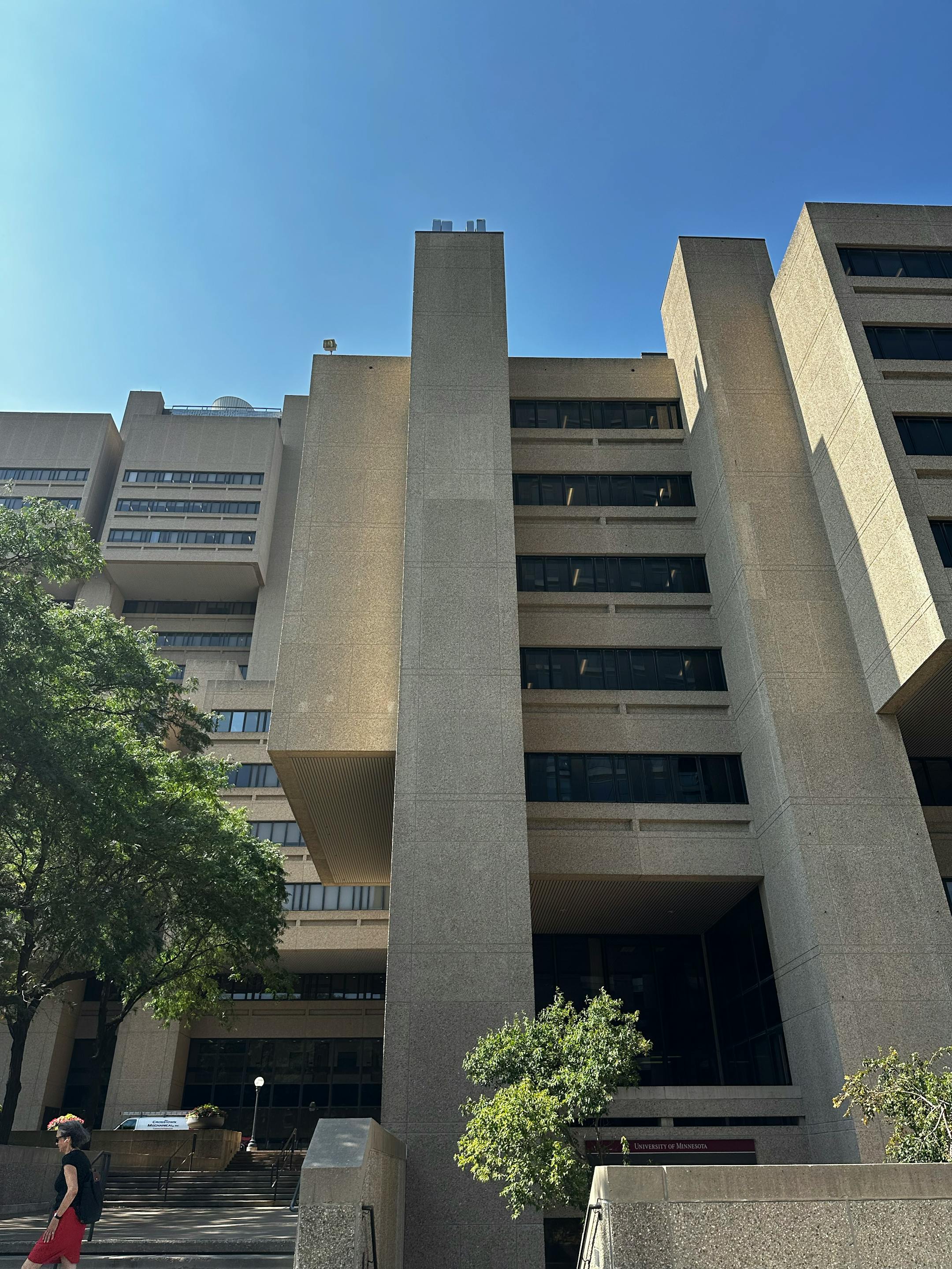
It has blocky outcroppings on top, which make it more oppressive. Why taper or set back when you can park the architectural equivalent of a fist on top? The overscaled square masses on top fit into grooves on the side, as if they’re giant elevator cars that pound up and down, smashing anyone beneath.

It’s a good thing most of the clinics were moved to a new facility a few years ago. Nothing about this building says “healing.” Everything about this building says “submit.”

At the time it was finished in 1976, though, it was the latest thing, which undoubtedly gave the impression that the facilities were state of the art. It was never a beautiful place, but in the recessionary, post-Watergate ‘70s, the future didn’t look all that beautiful, either.

The HCMC’s main structure, the Red Building (730 S. 8th St.), is the cousin to Phillip-Wangensteen, but a low-slung version that looks like a castle built by depressed Lego movie characters. If you asked strangers whether it was a hospital or a waste-processing facility, they might be stumped for an answer.

Hennepin Healthcare, which operates HCMC, will build a new center that will provide mental health treatment for mothers.
HCMC in downtown Minneapolis in 2016.. (Star Tribune file/The Minnesota Star Tribune)

Across the street, the new HCMC addition that serves as a complete rebuke to the original structure: the Hennepin Healthcare Clinic and Specialty center (715 S. 8th St.). It faces the HCMC’s Soviet facade with a clean and pleasing blue glass wall, curving like the swirl of a skirt (or hospital gown, if you like), transparent and inviting. Everything about it connotes peace and relief.

Inspectors from the Food and Drug Administration visited HCMC 17 times in April as part of an investigation into the hospital's sedative research.
The Hennepin Healthcare Clinic and Specialty center. (Star Tribune/The Minnesota Star Tribune)

That’s the direction the new proposed HCMC tower should take. Glass, not concrete. Thin bands of aluminum or steel, not heavy metal panels. A tower that tapers on the top or rounds off — anything but a flat roof that suggests an arbitrary cutoff or an earthbound emotion. Something that not only connotes hope, but uplift.

But red? That’s the color of the proposed ramp. Dark red. Is that really the color we want for a hospital? It’s a matter of taste, of course, but whether the color of a soaked garment on an ambulance gurney is right for a hospital doesn’t seem like that hard a call. Blue’s available. Green’s calendar is open.

“The red stuff stays on the inside” seems like a good idea for a medical center.

about the writer

James Lileks

Columnist

James Lileks is a Star Tribune columnist.

See More